Washington State · 37 Counties

Smoke, Silence,
and Inequality

Understanding the forces behind lung cancer in Washington State — and who will bear the burden tomorrow.

WTN Cancer Incidence Data BRFSS Smoking Surveys IHME County Estimates WTN Radon Test Levels
The problem

The Burden of Lung Cancer

Lung cancer is the second most common cancer in the United States, but it remains the deadliest. It kills more Americans each year than colorectal, pancreatic, and breast cancer individually. Understanding why, and who is most at risk, is the first step toward prevention.

 
Estimated US lung cancer deaths in 2026 (American Cancer Society, 2026a)
#1
Cancer killer in the US and in Washington State
 
Approximate US 5-year relative survival, all stages combined (American Cancer Society, 2026b)
 
WA average age-adjusted incidence rate per 100,000 (WTN 2016–2020; Washington State Department of Health, n.d.-a)

National burden statistics in this section come from the American Cancer Society and SEER-based survival summaries (American Cancer Society, 2026a, 2026b). Washington incidence rates come from the Washington Tracking Network (Washington State Department of Health, n.d.-a).

Lung cancer's lethality stems partly from late detection: many cases are not found until the cancer has already spread, when treatment options are more limited. In Washington State, rates vary dramatically across the 37 counties, from about 30.7 per 100,000 in Whitman County to 72.2 in Mason County. Those differences are unlikely to come from any single cause. They more likely reflect a mix of smoking history, occupational exposures, geography, screening access, and other county-level differences — and understanding those layers is exactly what this research set out to do.

Background

What Causes Lung Cancer?

At the population level, three broad exposure groups drive most lung cancer risk. Cigarette smoking is by far the dominant cause, but radon gas — invisible, odorless, and present in homes across Washington — is the second leading cause. The percentages below are approximate US-level background context, not shares calculated from the Washington county dataset.

Click a segment to see details

Approximate US attribution summary from American Cancer Society, CDC, and EPA background sources (American Cancer Society, 2026a; Centers for Disease Control and Prevention, 2024; U.S. Environmental Protection Agency, 2024).

🚬 Cigarette Smoking — 85%

Smoking is the leading cause of lung cancer, responsible for roughly 85% of lung cancer deaths in the US. Tobacco smoke contains more than 70 known carcinogens that directly damage DNA in lung cells. The risk extends beyond smokers: secondhand smoke also causes thousands of lung cancer deaths each year in the US, and repeated exposure in homes and workplaces adds to the burden. (American Cancer Society, 2026a; Centers for Disease Control and Prevention, 2024)

☢️ Radon Gas — 10%

Radon is a naturally occurring radioactive gas produced by the decay of uranium in soil and rock. It enters buildings through cracks and gaps in foundations, and when inhaled, its decay products lodge in lung tissue and emit radiation. The EPA action level is 4 pCi/L, and EPA estimates roughly 1 in 15 US homes has elevated radon. Crucially, the risk is synergistic: smoking and radon multiply each other rather than acting as separate risks. (U.S. Environmental Protection Agency, 2024)

🏭 Occupational & Other — 5%

The remaining 5% comes from occupational carcinogens — asbestos (shipyards, insulation), diesel exhaust, silica dust, wood dust, and chromium compounds — as well as outdoor air pollution, arsenic in drinking water, and genetic factors. In Washington State, the industrial history of western counties (shipyards in Pierce and Kitsap, timber mills in Grays Harbor, Mason, and Cowlitz) makes occupational exposure a plausible, though unmeasured, contributor to some of the county-level differences we observe.

Radon + smoking synergy: EPA risk tables estimate that long-term exposure at 4 pCi/L causes about 7 lung cancer deaths per 1,000 never-smokers, but about 62 per 1,000 current smokers. That gap is why radon matters most in places where smoking is still common. (U.S. Environmental Protection Agency, 2024)

The core argument

Four Things This Analysis Shows

The dominant driver

Smoking: Six Decades of Decline

At its peak in 1965, about 42% of American adults smoked cigarettes. Thanks to public health campaigns, tobacco taxes, smoke-free laws, and changing social norms, that figure has fallen to about 11% in recent national data — a transformation that will keep reducing lung cancer rates for decades to come.

Source: CDC National Health Interview Survey (NHIS), US adult cigarette smoking prevalence (Centers for Disease Control and Prevention, 2024).

How smoking damages lungs

Carcinogens in tobacco smoke cause DNA mutations in bronchial cells. With repeated exposure over years, these mutations accumulate until a cell becomes cancerous. Because lung cells renew slowly, damage from smoking decades ago persists long after quitting.

Beyond the smoker

Smoking prevalence in a county captures more than current smokers. It reflects secondhand exposure in homes and workplaces, historical smoking patterns in the workforce, and the social norms that shaped behaviors decades ago — the actual period when today's cancers were initiated.

WA county data (WTN BRFSS)

The Washington Tracking Network uses Behavioral Risk Factor Surveillance System (BRFSS) telephone surveys to estimate county-level smoking rates. These range from 4.6% in Adams County to 21% in Ferry County in the 2020–22 survey — a 5-fold difference. But some county estimates are noisy: several are based on small samples, wide confidence intervals, or an NR ("not reliable") flag. (Washington State Department of Health, n.d.-d)

The core finding

Current Smoking vs Cancer: Why the Correlation Is Modest

Current smoking and lung cancer still move in the expected direction at the county level, but the relationship is only moderate. That is what we would expect when recent survey data are being compared with cancers caused by older exposures, and when counties differ on many other health and social factors at the same time.

What is r?

Pearson r measures the direction and strength of a straight-line relationship. Positive means higher smoking tends to go with higher cancer; negative means the opposite.

What is R²?

R² is the share of county-to-county variation captured by the trend line. R² = 0.14 means smoking alone captures 14% of the differences between counties in this specific dataset.

What is the p-value?

The p-value asks how surprising this pattern would be if the true county-level relationship were zero. Smaller p-values mean the pattern is harder to dismiss as random noise.

Significant vs not

Here, p < 0.05 is labeled statistically significant. That is evidence of a pattern in this dataset, not proof of causation. "Not significant" is not the same as "no effect."

r = +0.37
Direction + strength
R² = 0.14
County variation captured
p = 0.024
Statistically significant
n = 37
Counties in analysis

Current smoking (WTN BRFSS 2020–22) vs lung cancer incidence rate (WTN 2016–20). Hover over dots for county details. Highlighted counties are notable outliers. Several county smoking estimates come from relatively small BRFSS samples, and some are flagged NR, which adds noise to this plot. (Washington State Department of Health, n.d.-a, n.d.-d)

A map view makes the same county pattern easier to read spatially: current smoking is highest across several rural inland counties, while the lung cancer map stays elevated in parts of the southwest coast and interior. The overlap is real, but it is not perfectly one-to-one. (Washington State Department of Health, n.d.-a, n.d.-d)

Washington current smoking county map shown beside lung cancer incidence county map

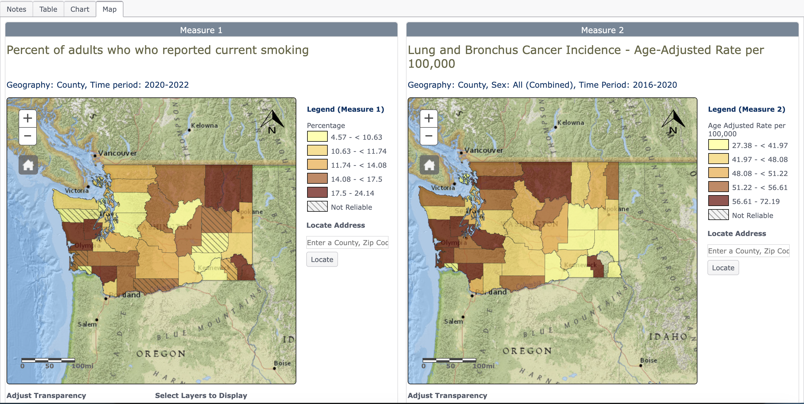
Side-by-side county maps from the Washington Tracking Network comparing current smoking estimates with lung cancer incidence.

What the numbers mean in plain English: Counties with more current smokers do tend to have more lung cancer, but the scatter is still wide. R² = 0.14 means current smoking does not explain most of the county-to-county differences by itself.

Why p = 0.024 matters: If there were truly no county-level relationship at all, a pattern at least this strong would show up by chance only about 2.4% of the time. That clears the usual 5% cutoff for statistical significance.

Why the fit is still modest: Lung cancer takes 15–30 years to develop after smoking exposure, so the 2020–22 survey does not line up with the most relevant exposure years for cancers diagnosed in 2016–2020. County-level results are also diluted by survey noise, occupational exposure, healthcare access, and demographic differences. A moderate ecological correlation is therefore still consistent with smoking being the main causal driver of lung cancer.

Digging deeper

Historical Smoking Aligns Better with Cancer Rates

When the smoking data comes from earlier years closer to the biologically relevant exposure window, the county-level relationship becomes much stronger. That is what we would expect for a disease that develops over decades rather than immediately after exposure.

WTN BRFSS 2020–22 (current)
R² = 0.14
r = +0.37 · p = 0.024
~50–200 survey respondents per county
IHME modeled estimate 1996
R² = 0.43
r = +0.654 · p < 0.001
4.7 million respondents, Bayesian spatial model
r = +0.654
Direction + strength
R² = 0.428
County variation captured
p < 0.001
Very strong evidence

IHME modeled county smoking prevalence vs lung cancer incidence (WTN 2016–20), Washington State, 37 counties. IHME combines many years of survey information to produce more stable county estimates than a single BRFSS snapshot. (Dwyer-Lindgren et al., 2014)

How R² improves as data quality and time-lag alignment improve:

WTN BRFSS 2020–22 (current smoking) R² = 0.14
WTN BRFSS 2010 (10-yr lag) R² = 0.17
WTN BRFSS 2004 (15-yr lag) R² = 0.22
IHME 2004 (modeled, 15-yr lag) R² = 0.42
IHME 1996 (modeled, 20-yr lag) R² = 0.43

Important interpretation: An ecological R² of 0.43 does not mean smoking causes only 43% of lung cancers. It means this county-level smoking variable captures 43% of the differences between counties in this dataset. The main lesson is that older smoking data, especially when measured more stably, matches present-day cancer rates much better than current smoking does. (Dwyer-Lindgren et al., 2014)

The second cause

Radon: Risk and Measurement

Radon is a radioactive gas that seeps from the ground into homes and increases lung cancer risk over time. In this presentation, radon is examined with two different county datasets: WTN household test results and the EPA county radon zone map. They describe related but different kinds of risk, so they should not be interpreted in the same way.

☢️

Uranium Decay

Radon forms when uranium in soil, rock, and groundwater naturally decays. It rises through the ground and enters buildings through cracks, drains, and construction joints.

4 pCi/L

EPA Action Level

The EPA recommends mitigation for any home testing above 4 picocuries per liter. The national average indoor level is about 1.3 pCi/L. WTN tracks the % of tests above this threshold by county.

🏠

Entry Points

Radon enters through foundation cracks, floor-wall joints, construction gaps, and water supplies. Basements and ground-floor rooms accumulate the highest concentrations. Proper ventilation and sub-slab depressurization reduce levels significantly.

10× Synergy

A smoker in a high-radon home faces roughly 10 times the lung cancer risk of a non-smoker in a low-radon home. The two risk factors don't just add — they multiply. This makes high-radon counties particularly dangerous for smoking populations.

WTN household test data

WTN reports the percentage of submitted residential tests in each county that came back at or above 4 pCi/L. This is the closer dataset to measured indoor exposure, but it still depends on who chose to test and where they tested. It is best read as a county screening indicator rather than a complete census of all homes. (Washington State Department of Health, n.d.-a, n.d.-b, n.d.-c)

EPA county radon zones

EPA assigns each county to Zone 1, 2, or 3 based on radon potential from geology, indoor measurements, aerial radioactivity, soil parameters, and foundation types. It is a county-level potential classification, not a percentage of tested homes. EPA also states that homes with high radon have been found in all three zones, so the zone map should not be used to decide whether a specific home should be tested. (U.S. Environmental Protection Agency, 2025)

How the two radon datasets compare: In this presentation, the WTN test data and the EPA zone map tell a similar broad geographic story: radon potential is generally higher in eastern and inland Washington than in much of western Washington. That agreement lends credibility to the map pattern, yet the correlation results present a more perplexing finding: the WTN radon measure actually turns negative against lung cancer at the county level, while the EPA zone map still fails to produce the expected positive relationship. (U.S. Environmental Protection Agency, 2025; Washington State Department of Health, n.d.-c)

Selected Counties for Radon, Income, and Cancer Comparison

The counties below are shown as a comparison snapshot that puts radon screening results next to income and cancer context. The percentage shown is still a screening metric based on submitted household tests, not a direct estimate of how many homes in the county are high-radon, and it should be read cautiously when county testing volume is low.

# County % Tests ≥ 4 pCi/L Screening flag Median household income Cancer rate (per 100k)
Interpreting the county data

An Unexpected Result: Radon Correlates Backward

Radon is a proven lung carcinogen. That is why this result is so startling: in the county-level data, places with higher radon measurements appear to have lower lung cancer rates. The raw correlation runs in the wrong direction. That does not mean radon is protective. It means confounding, measurement limits, and the gap between household exposure and county averages are overpowering the biology in this dataset.

r = −0.30
Opposite of the expected direction
R² = 0.09
County variation captured
p = 0.068
Not significant at 0.05
n = 37
Counties in analysis

% of radon tests ≥ 4 pCi/L (WTN) vs lung cancer incidence rate (WTN 2016–20). Instead of sloping upward, the trend line falls: counties with more elevated radon tests appear to have less lung cancer. That is the opposite of what radon biology predicts, and the underlying county radon sample sizes range from extremely small to very large, so some points are much less stable than others.

The county map comparison shows why the scatter can be misleading at first glance: elevated radon test results cluster more in eastern and inland counties, while the highest cancer rates are concentrated differently. The visual mismatch is exactly the ecological problem discussed below.

Washington radon test county map shown beside lung cancer incidence county map

Side-by-side county maps comparing the share of radon tests at or above 4 pCi/L with lung cancer incidence.

How to read this result: The shock here is that a known carcinogen shows up with a negative county-level slope. The contradiction is between the limits of the county dataset and the known biology, not between radon science and reality. A p-value of 0.068 means this backward pattern is still weak enough that it can plausibly arise from noise and confounding in county-level data.

Why this doesn't mean radon is safe

1. Testing bias

Counties with higher radon awareness may test more often. But those same counties can also have lower smoking rates, better healthcare access, or different demographics — making county cancer rates look lower even when radon concern is real.

2. Smoking dominates

Smoking remains the dominant driver of lung cancer. Its county-level variation can easily overwhelm any radon pattern. Once smoking history is taken into account, the remaining radon signal becomes too small and unstable to interpret confidently at the county level.

3. Ecological fallacy

We're correlating county averages, not individual exposures. A county with a high share of elevated tests can still contain many homes below the threshold, while a county average can hide the households that face the greatest danger. County averages mask the people who actually experience the exposure.

4. Time lag & sample size

Cancer diagnosed in 2016–2020 reflects exposure from many years earlier. Recent radon tests do not perfectly line up with the most relevant exposure window, and some counties have very limited testing, which makes county percentages noisy and easy to overread.

Partial correlation: Radon after controlling for smoking

AnalysisRadon r with cancerp-valueInterpretation
Raw (no controls) −0.30 ns 0.068 Looks backwards at first glance, as if more radon meant less cancer, but the pattern is better explained by confounding
Controlling for IHME 1996 smoking −0.071 ns 0.69 Any remaining county-level association becomes too weak to interpret with confidence

Key takeaway: Radon is still a real carcinogen. The county-level Washington analysis does not overturn that evidence; it only shows that these county radon indicators are not strong stand-alone predictors of cancer incidence in this dataset. The practical implication for this presentation is to use radon data to identify where testing and mitigation should be prioritized, not to judge whether radon is biologically dangerous. (U.S. Environmental Protection Agency, 2025; Washington State Department of Health, n.d.-b, n.d.-c)

The equity question

Equity, Poverty, and Who Can Respond to Risk

Income does not predict lung cancer rates in a simple straight line across Washington counties, but it does shape who can respond to risk. The equity issue here is not only where smoking or radon burden may exist. It is also who can test, who can pay for repairs, who can reach screening, who can get permission to fix a rental unit, and who can find qualified help nearby.

r = +0.051
Income vs cancer ns
r = −0.362
Radon vs income sig

Lower income does not directly predict higher cancer rates here (r = +0.051, not significant). Wealthier western counties such as Pierce and Kitsap still have high cancer rates because smoking history, occupational history, and healthcare patterns do not map neatly onto income alone. But income does matter for response capacity: Washington DOH states that testing is the only way to know a home's level, EPA notes that mitigation usually requires trained help, and a 2024 peer-reviewed study in North Carolina found that radon testing rates were higher in more affluent neighborhoods and lower in disadvantaged ones. (U.S. Environmental Protection Agency, 2024; Washington State Department of Health, n.d.-b; Yang et al., 2024)

The equity trap: Counties such as Ferry, Okanogan, and Lincoln combine lower incomes with elevated radon concern. That matters because households may face several barriers at once: testing has to happen before risk is even visible, renters may need landlords to authorize repairs, mitigation can compete with other urgent household costs, and certified or qualified radon professionals may be harder to access in rural areas. Similar barriers can also affect smoking cessation, screening, and follow-up care. (U.S. Environmental Protection Agency, 2024, n.d.; Washington State Department of Health, n.d.-b)

Radon level vs median income — selected counties shown

This scatter is a readable snapshot used to illustrate the pattern visually. The summary statistics beside it refer to the broader county-level analysis.

Low income (<$55k) Mid income ($55–65k) Higher income (>$65k)
Looking ahead

Where Should Prevention Attention Focus Next?

Historical smoking predicts cancer better than current smoking because of the lag between exposure and disease. That means today's smoking rates are better read as a planning signal than as a direct forecast. Counties with the highest current smoking burden deserve the closest prevention attention over the next decade, especially where lower income and access barriers may slow response.

Current adult smoking rates by WA county (WTN BRFSS 2020–22). Bars are colored by median household income so the overlap between smoking burden and fewer economic resources is easier to see. (U.S. Census Bureau, n.d.; Washington State Department of Health, n.d.-a, n.d.-d)

Low income (<$55k) Mid income ($55–70k) Higher income (>$70k)

A planning watchlist: Based on the lag between smoking exposure and lung cancer diagnosis, Ferry, Grays Harbor, Pend Oreille, Asotin, Lewis, Mason, Okanogan, and Cowlitz are reasonable counties to watch closely. They are highlighted here because they remain high on current smoking and related vulnerability indicators, not because this site has built a formal forecasting model or estimated future county incidence directly.

Statewide progress, uneven improvement

Washington has made substantial statewide progress in reducing smoking, and that is likely to reduce future lung cancer burden overall. But this presentation also shows that the remaining burden is not evenly distributed. Many of the counties highest on current smoking are rural or economically constrained, which means the counties most in need of prevention may also be the least able to absorb the costs of quitting support, testing, mitigation, transportation, and specialty care.

Taking action

What Can Be Done?

The recommendations below are evidence-informed actions suggested by the presentation's main findings. The smoking analyses identify where the strongest county-level predictor remains concentrated. The radon analyses show where exposure may be more common, even though county cancer correlations are weak. The equity analyses show that the burden is shaped not only by risk, but by unequal ability to respond.

🚬

Smoking Cessation

This is the most direct intervention supported by the presentation. Smoking history is the strongest county-level predictor shown anywhere in the analysis, so reducing smoking remains the clearest path to reducing future lung cancer.

  • Expand quit-line funding and outreach in high-smoking rural counties (Ferry, Grays Harbor, Lewis, Okanogan)
  • School-based tobacco prevention programs in counties with current smoking rates above 17%
  • Targeted digital and radio campaigns for communities with limited internet access
  • Insurance coverage mandates for cessation medications and counseling
☢️

Radon Mitigation

The presentation does not show a strong county-level radon-cancer correlation, but it does identify where radon concern may be more common through both WTN test results and EPA zone classifications. That is enough to justify prevention at the household level.

  • Mandatory radon testing disclosures in all real estate transactions
  • Subsidized test kits and mitigation contractor vouchers for low-income households in Lincoln, Ferry, and Okanogan counties
  • Building code updates requiring radon-resistant construction in Zone 1 counties
  • School building radon testing programs in eastern Washington
🏥

Healthcare Access

County incidence reflects more than exposure alone. It also reflects who can get screened, diagnosed, referred, and treated quickly. Although this project did not directly measure care access, better access is a reasonable prevention priority in counties where smoking burden remains high and travel distances are longer.

  • Mobile CT lung cancer screening units serving rural counties with no major hospital
  • Expand outreach for people who already meet USPSTF low-dose CT screening eligibility, especially in high-smoking and high-barrier counties
  • Telehealth oncology consultation programs for counties with limited specialist access
  • Community health worker programs trained in early symptom recognition
⚖️

Equity-Targeted Outreach

The presentation's clearest equity lesson is that environmental risk and response capacity do not fall in the same places. Some counties face overlapping smoking burden, radon concern, and fewer resources to act quickly.

  • Prioritize Ferry, Okanogan, Lewis, and Grays Harbor — where high smoking, elevated radon, and low income converge
  • Fund county-level epidemiological coordinators in communities with limited public health infrastructure
  • Partner with tribal nations in eastern WA (Colville, Spokane tribes) on culturally tailored lung health programs
  • Report county-level lung cancer trends publicly on an annual basis to create accountability

References

In-text citations use APA-style author-date format. References are listed alphabetically below.

  • American Cancer Society. (2026a, January 13). Key statistics for lung cancer. https://www.cancer.org/cancer/types/lung-cancer/about/key-statistics.html
  • American Cancer Society. (2026b, January 13). Lung cancer survival rates. https://www.cancer.org/cancer/types/lung-cancer/detection-diagnosis-staging/survival-rates.html
  • Centers for Disease Control and Prevention. (2024, September 17). Current cigarette smoking among adults in the United States. https://www.cdc.gov/tobacco/php/data-statistics/adult-data-cigarettes/index.html
  • Dwyer-Lindgren, L., Mokdad, A. H., Srebotnjak, T., Flaxman, A. D., Hansen, G. M., & Murray, C. J. L. (2014). Cigarette smoking prevalence in US counties: 1996–2012. Population Health Metrics, 12, Article 5. https://doi.org/10.1186/1478-7954-12-5
  • U.S. Census Bureau. (n.d.). American Community Survey 5-year estimates. https://www.census.gov/programs-surveys/acs
  • U.S. Environmental Protection Agency. (n.d.). A radon guide for tenants. https://www.epa.gov/sites/default/files/2014-08/documents/tenants_guide.pdf
  • U.S. Environmental Protection Agency. (2024). A citizen's guide to radon: The guide to protecting yourself and your family from radon. https://www.epa.gov/system/files/documents/2024-11/2016-a-citizens-guide-to-radon.pdf
  • U.S. Environmental Protection Agency. (2025, October 14). EPA map of radon zones. https://www.epa.gov/radon/epa-map-radon-zones-0
  • Washington State Department of Health. (n.d.-a). Data portal. Washington Tracking Network. https://doh.wa.gov/data-and-statistical-reports/washington-tracking-network-wtn/data-portal
  • Washington State Department of Health. (n.d.-b). Radon. https://doh.wa.gov/community-and-environment/contaminants/radon
  • Washington State Department of Health. (n.d.-c). Radon data. Washington Tracking Network. https://doh.wa.gov/data-and-statistical-reports/washington-tracking-network-wtn/radon
  • Washington State Department of Health. (n.d.-d). Tobacco and cannabis use data. Washington Tracking Network. https://doh.wa.gov/data-and-statistical-reports/washington-tracking-network-wtn/tobacco-and-cannabis
  • Yang, Z., Prox, L., Meernik, C., Raveendran, Y., Gibson, P., Koch, A., Clarke, J., Chen, R., Zhang, J. J., & Akinyemiju, T. (2024). Neighborhood-level socioeconomic disparities in radon testing in North Carolina from 2010 to 2020. Journal of Environmental Radioactivity, 277, 107460. https://doi.org/10.1016/j.jenvrad.2024.107460

Data & Methodology Note

All analyses use Washington State county-level data (n = 37). Cancer incidence is the age-adjusted rate per 100,000 population from WTN (2016–2020). Smoking data comes from WTN BRFSS county estimates and from the published IHME county smoking dataset. Radon is analyzed in two ways: WTN household test results (% of submitted tests at or above 4 pCi/L) and EPA county radon zones (Zone 1 to Zone 3 geologic potential categories). Pearson r describes the direction and strength of a straight-line relationship, while R² describes how much county-to-county variation is captured by a one-variable model. p-values below 0.05 are labeled statistically significant, meaning the pattern is unlikely to be random noise under a zero-relationship model; this does not prove causation. Important limitations are that some BRFSS county estimates are noisy, WTN radon results come from submitted tests rather than a full census of homes, and some visuals use selected counties to keep the comparison readable. This is an ecological study, so results describe county-level associations and should not be interpreted as individual-level causal effects. Radon is a proven carcinogen at the individual level; the absence of a clear county-level signal reflects data limitations, not biological safety.